Rescuing a beautiful property from 1990s design decisions
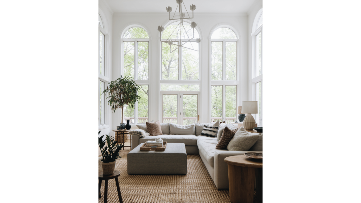
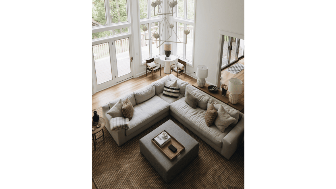
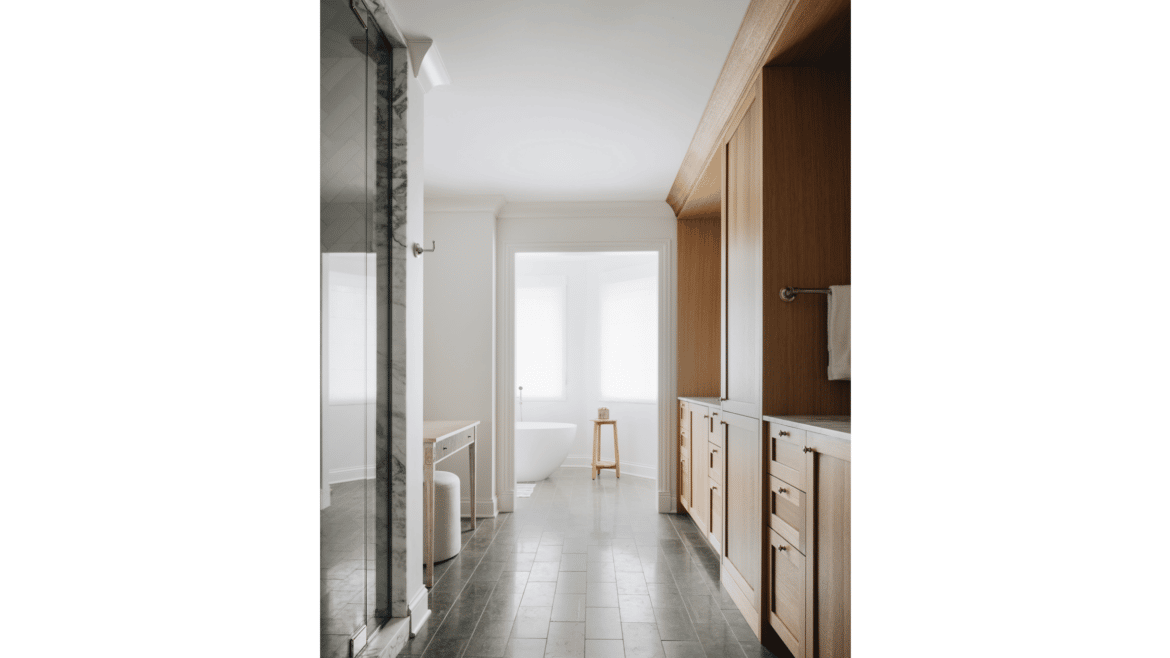
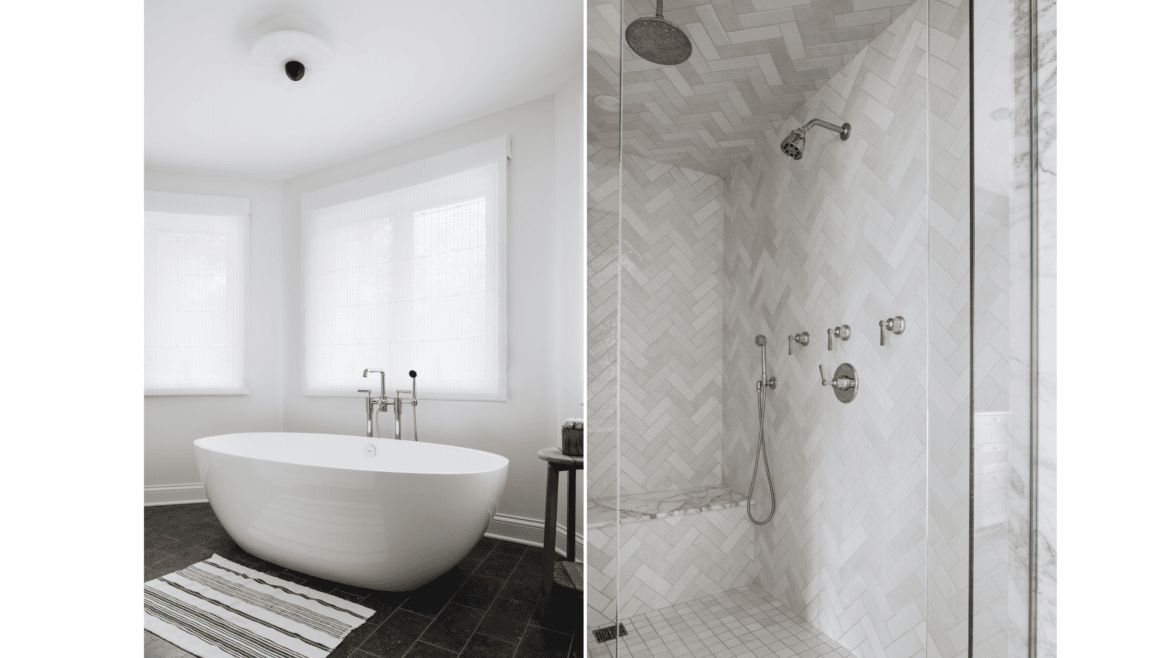
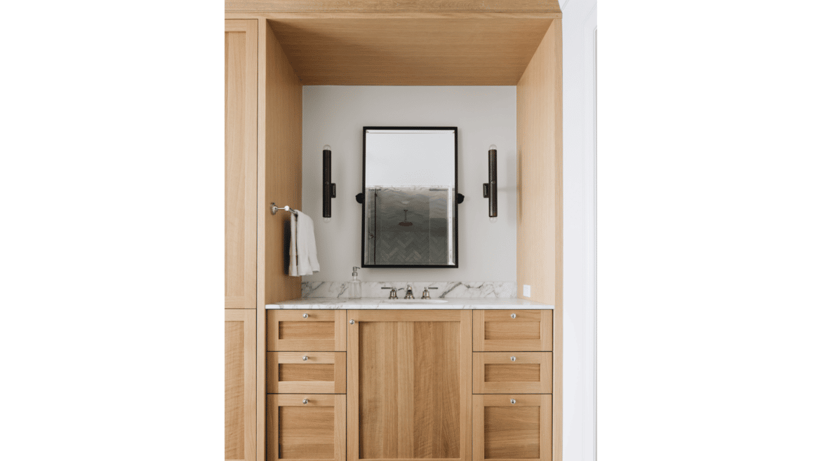
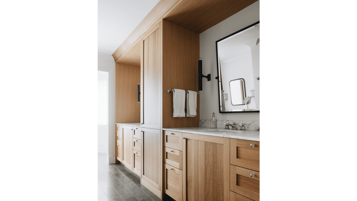
What started as an interior update of the kitchen and baths of a Sheridan Road house in the Braeside neighborhood of Highland Park, soon became a whole-house renovation. With aspirations to infuse Georgian house style, the design elevated developer-grade features, finishes and fixtures to a lighter, more natural and clean look.
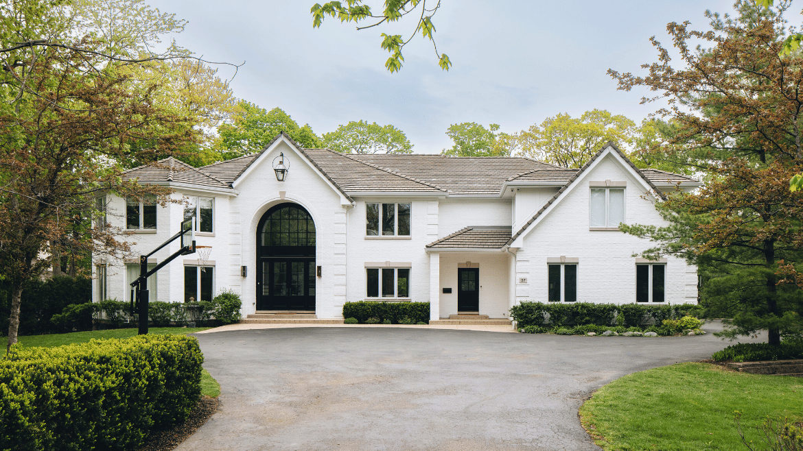
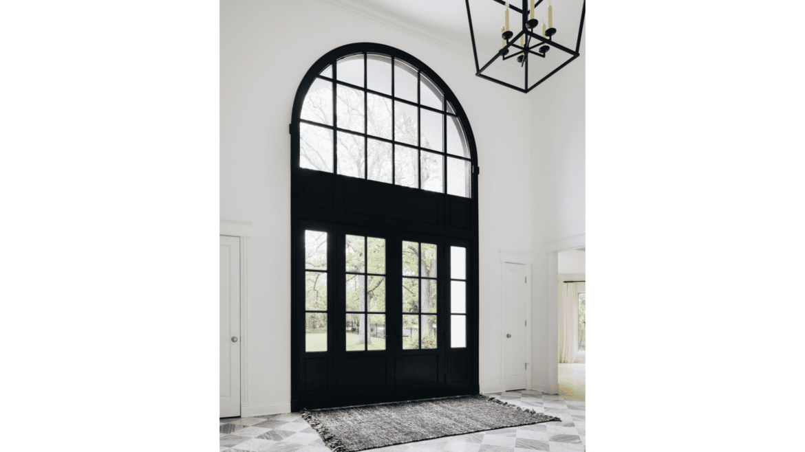
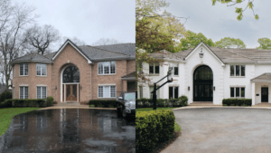
The exterior was transformed from a 1990s-style, pinky/peach brick that dated the house, to a more timeless white painted brick with white trim and all new light fixtures. A new front door with sidelights, installed below an existing semi-circle window, were painted black, giving the entrance an entirely new look.
Interior Design and Decorating a Georgian Brick Home
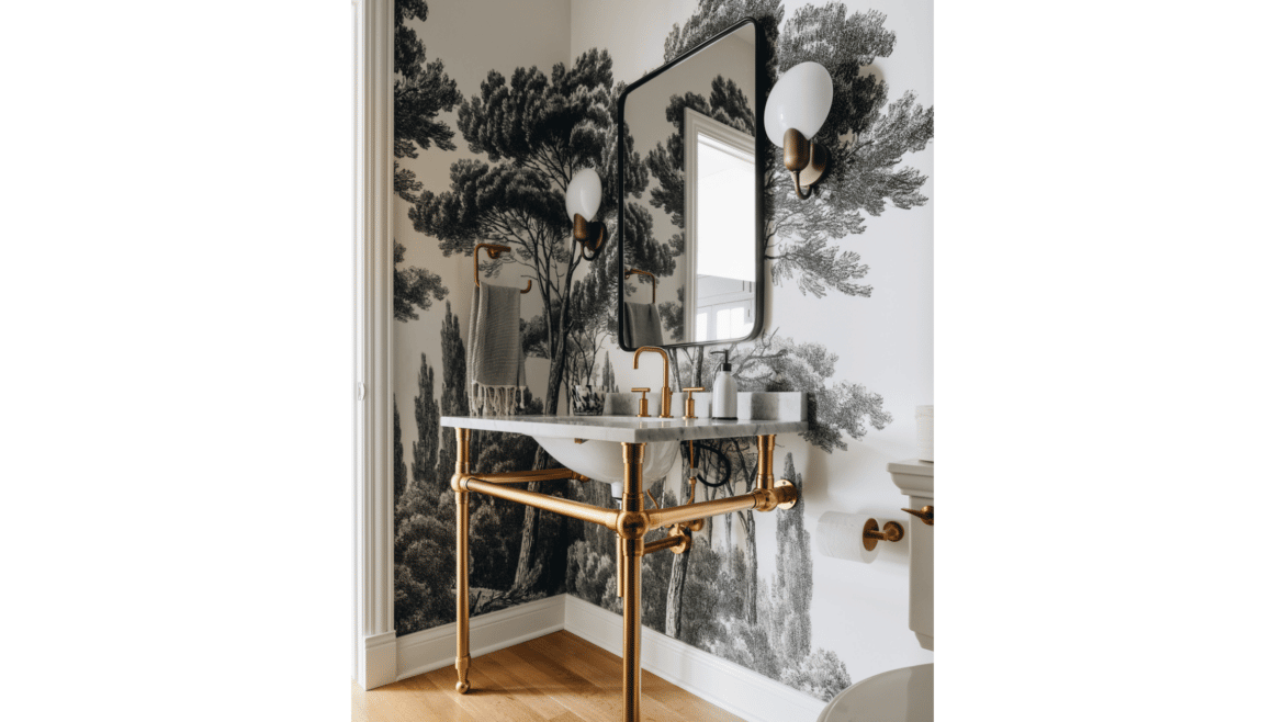
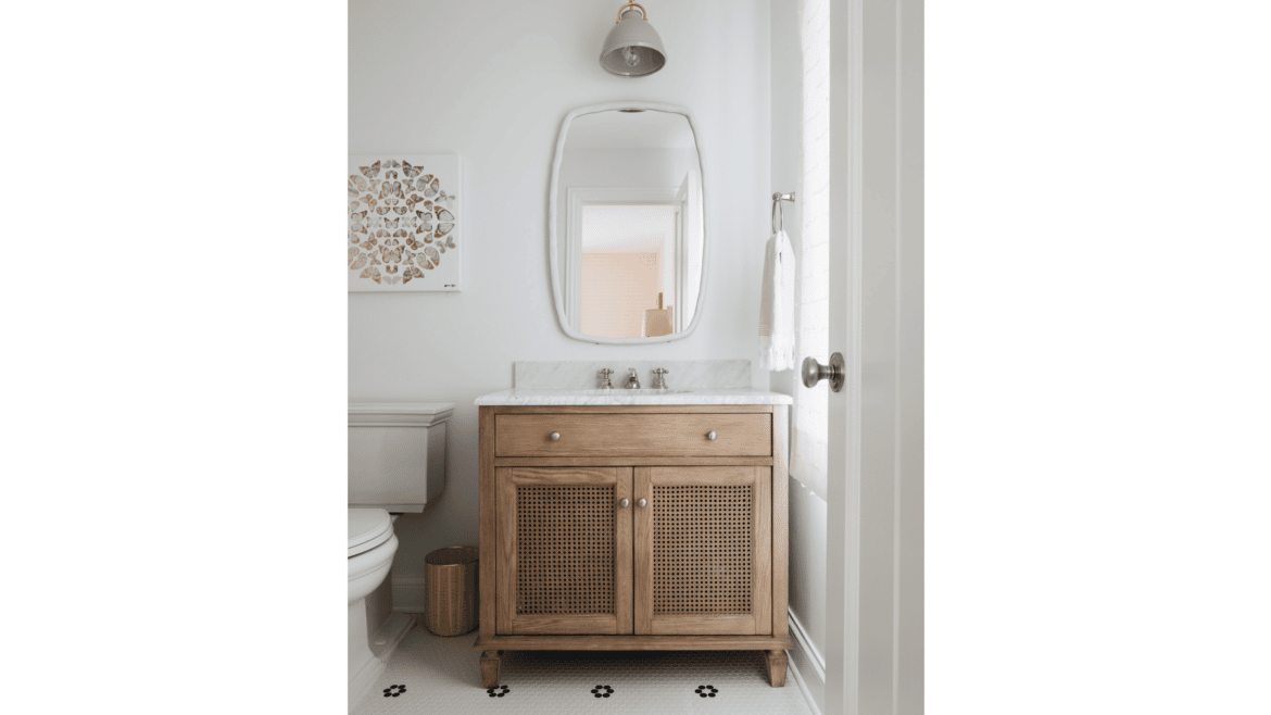
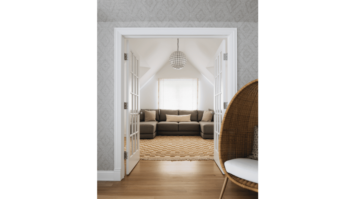
Interior designer Lauren Buxbaum Gordon and her team played an integral role in helping the homeowner pull together a vision for eliminating bright and saturated colors – like a royal blue kitchen and bright red dining and powder rooms – in favor of a soothing palette. Materials, paint and fabrics directed the conversation, to make everything more tranquil and neutral.
Georgian House Renovation Ideas That Add Value and Style
The huge lot and nearly 10,000 square foot home with 6 bedrooms and 5.5 bathrooms is situated on a ravine and close to the beach, with ample privacy that allows for generous windows as a focal point. Part of the remodel involved removing all of the snap-in window grills to declutter the stunning views. Other transformations pulling this home out of the decade when it was built – especially fun to see in the before/after photos – include:
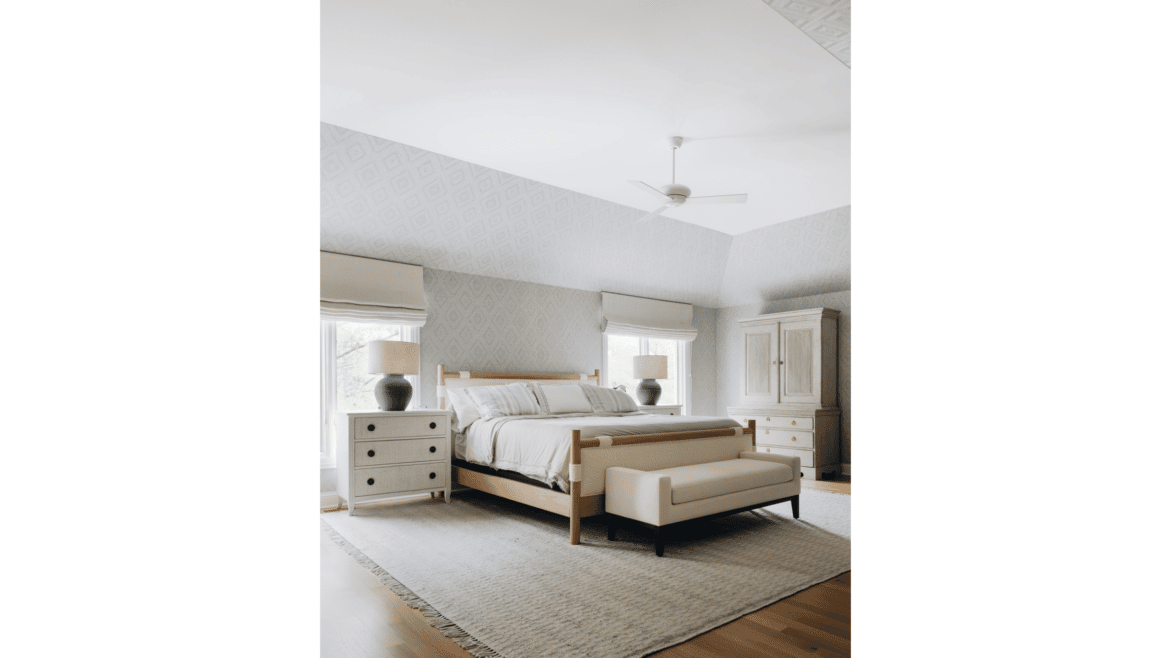
- Creating a simple cathedral ceiling in the primary bedroom that follows the roofline, in place of a multi-tiered wedding cake ceiling
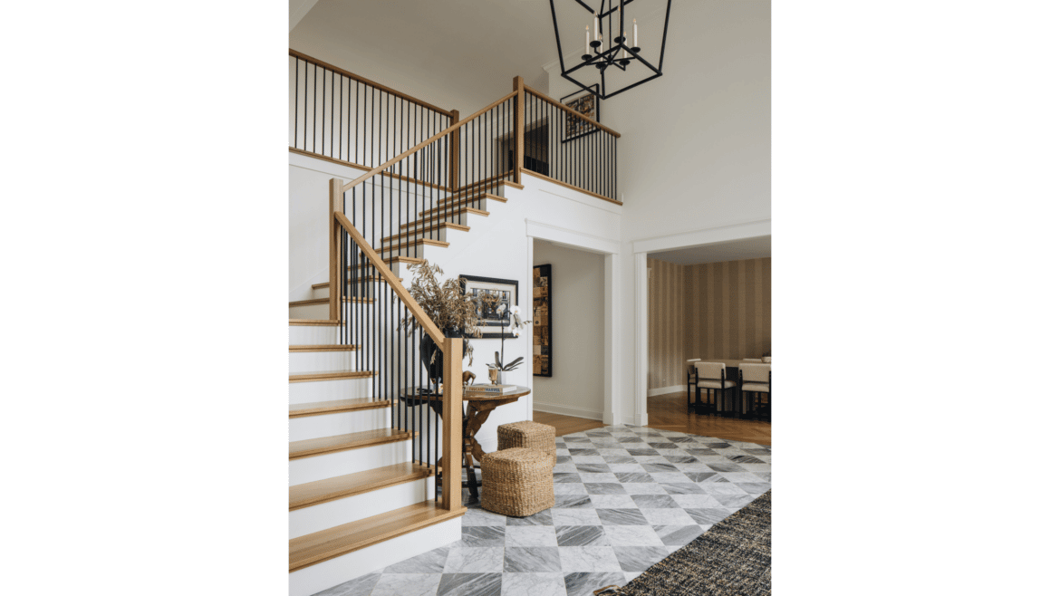
- Demolishing and rebuilding a heavy, rounded bridal staircase into a neutral, angled L-shaped stair, with metal balustrade
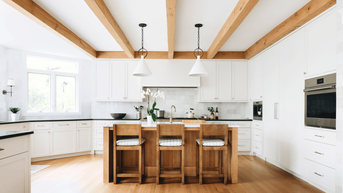
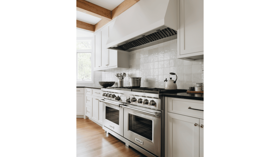
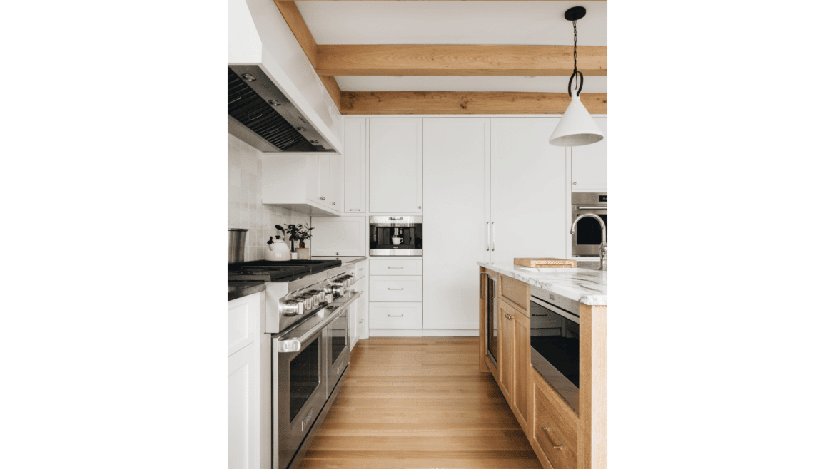
- Replacing curved soffits and a bright palette in the kitchen with angles, natural woods and custom-designed cabinetry in a reconfigured kitchen/breakfast/family room sequence
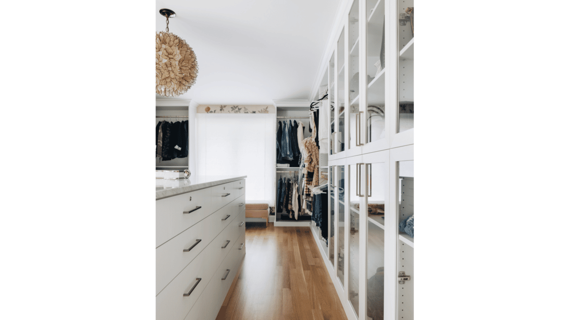
- Rooms where proportions were out of scale – like the 32’ x 26’ primary bedroom – were made smaller, allowing for more utility, like larger closets
- Adding simple, clear stain to refinished natural wood floors
As a unified design-build team, we were able to start demolition while still designing, a huge advantage for the homeowners. With the architect, builder and trades at the table from the outset, we were able to fully assess what the structure could handle while reimagining the spaces. We were able to recognize and solve problems without sacrificing time or cost because decision-making encompassed actual field conditions, instead of assumptions.
A visually-massive change has brought this home up to date and the homeowners the joy of beautifully refreshed spaces.
Have a look at the before and after changes!
Interior design credit: Nate Berkus Associates
Photography: Stoffer Photography Interiors
– – –
Save this to your Ideabook on Houzz
Houzz


