A modern refresh of a 1920s high-rise on Lake Michigan
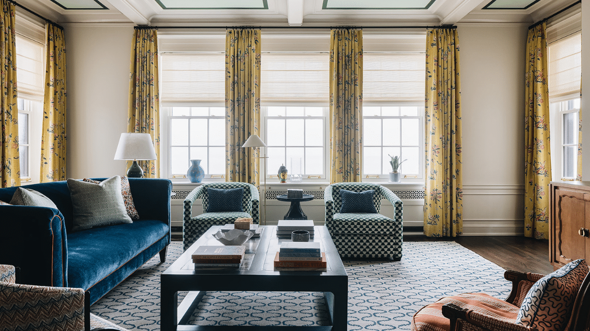
This project was an incredible opportunity to modernize a beautiful downtown lakefront condo that had not been touched since the late 1980s. Our architects worked with the young homeowners to reimagine the layout and design to make it feel less formal, add more connected and functional spaces for family gatherings and maximize views of the lake.
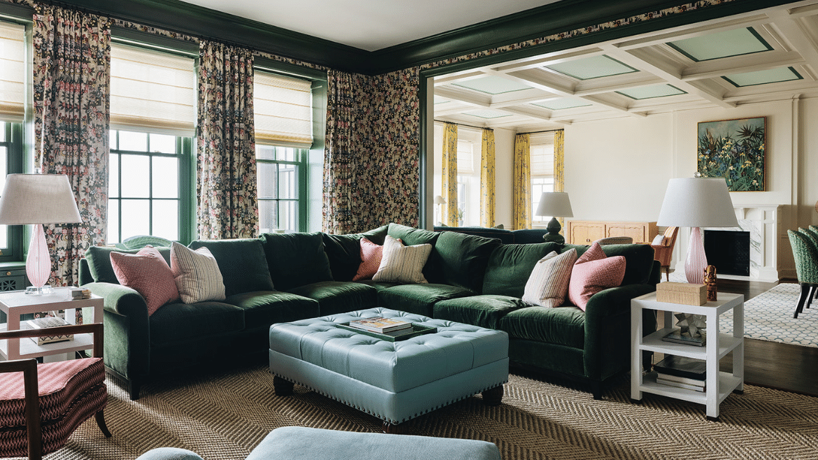
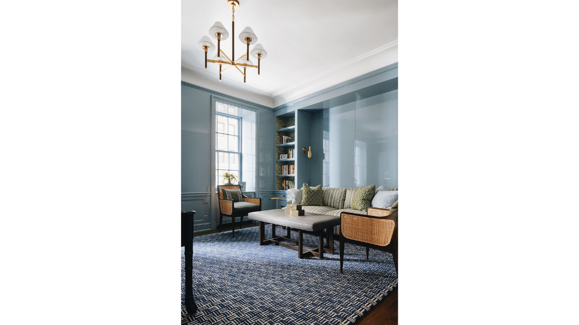
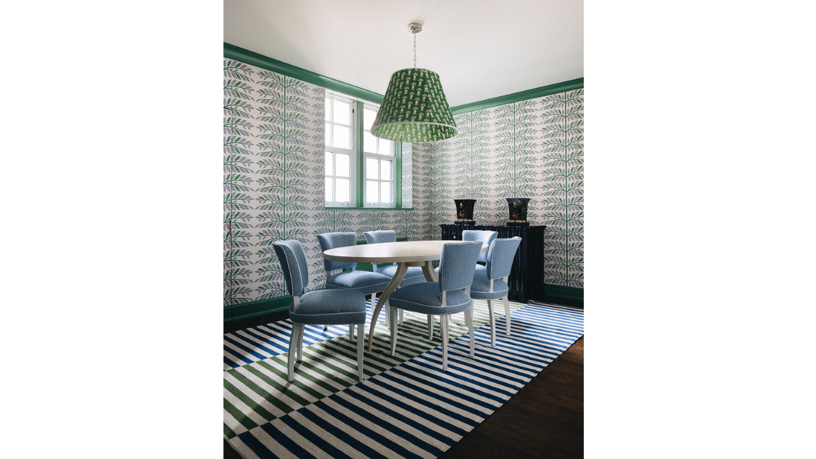
One of the most satisfying parts of this renovation is that it is hard to tell which design elements are original and which are brand new. Our team took a lot of inspiration form the existing structure and worked closely with Andrew Howard Interior Design to provide beautiful architectural spaces that would set off the bold choices in colors and patterns and graphic wallpaper chosen by the homeowner.
Modern Residential Architecture
- Space Proportions – To modernize older homes, our architects start by addressing the proportions of spaces. Small bedrooms and bathrooms and enormous hallways and living spaces of the past are no longer what homeowners need. In this project we took away a large foyer and gave 8 new feet to the kitchen. In fact, it was overall a project of removal, as we took out more walls out than we put in.
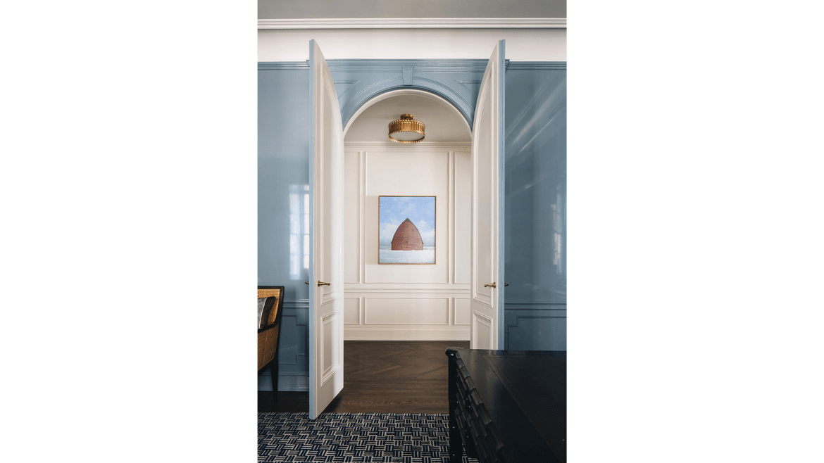
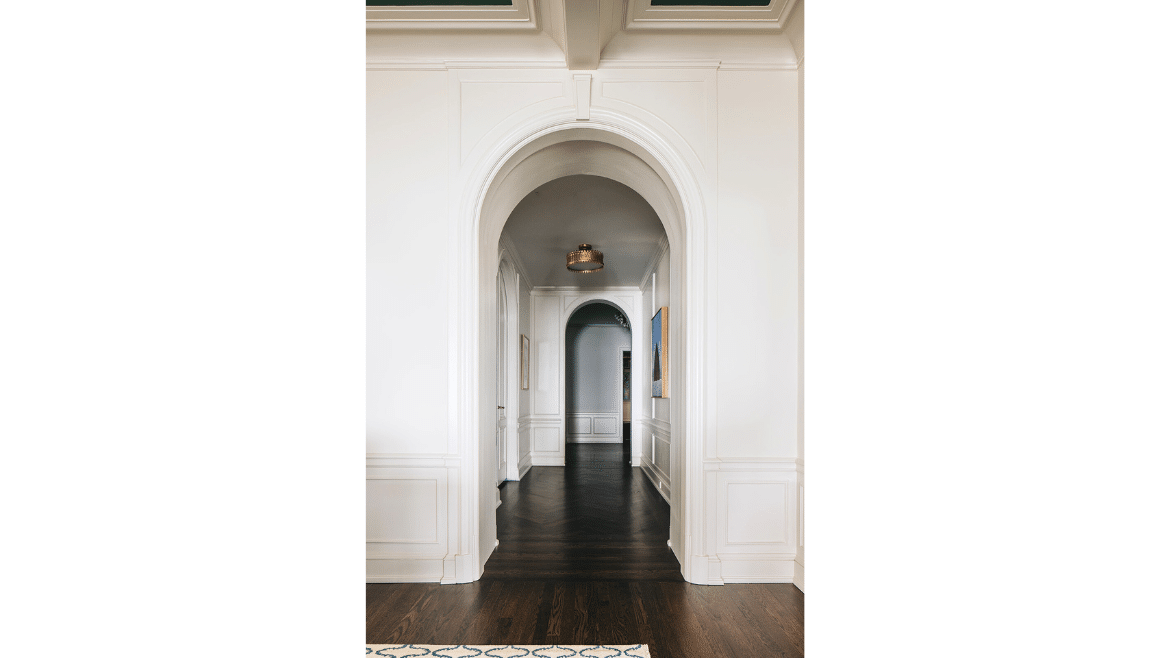
- Blend of Vintage and Modern Design – Certain elements were kept to bridge the vintage and modern design together, including a long barrel hallway ceiling, some of the applied and existing trim plaster molding, original arched doors framing the library/home-office and cove ceilings. Details that are inherently characteristic of the original architecture, like a hallway arch that replicates the original arch of the doors that lead into the library, now connect new pieces of construction to what’s always been here, so the renovation feels seamless.
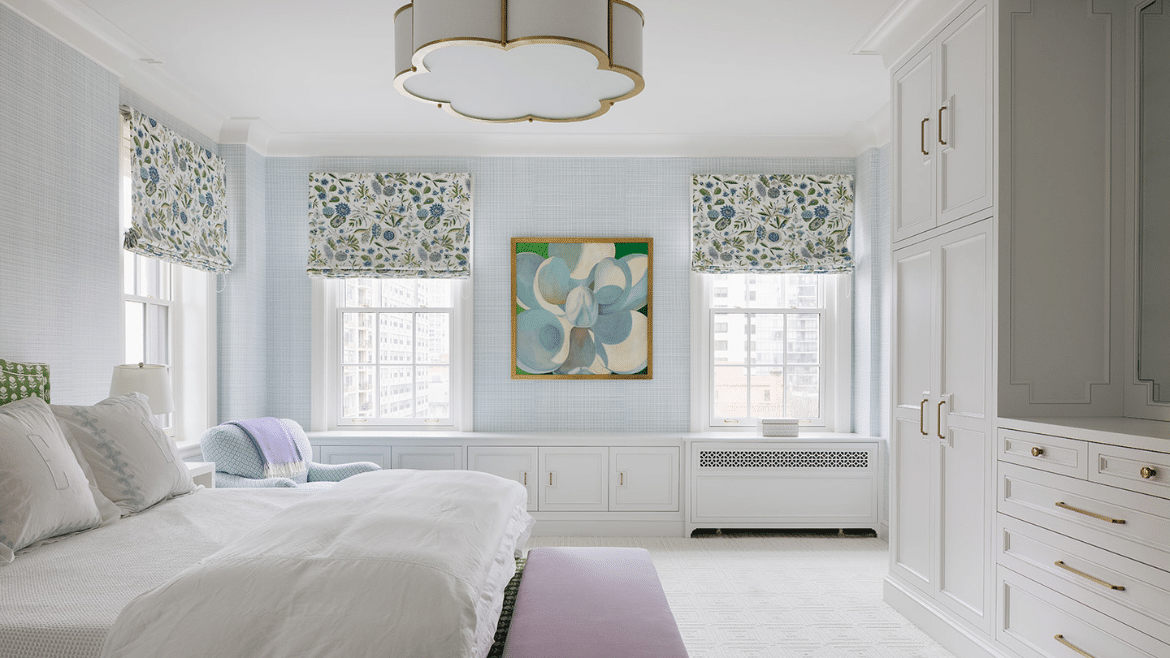
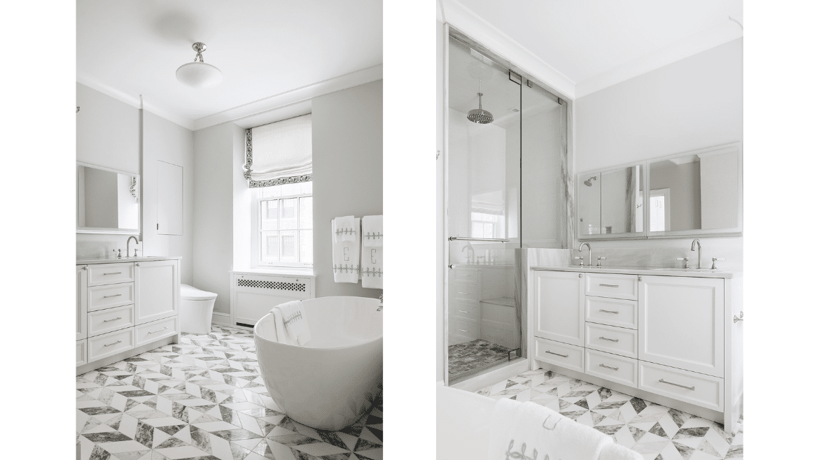
- Shift of Primary Suite Rooms – The size of the primary bedroom was, in fact, so large that it made the 9-foot ceilings feel even lower. We redesigned it to make it more functional with new built-ins and took some of the space for a larger primary bath. The bath now feels more proportionate and timeless, but not too traditional, with a free-standing tub, dramatic floor tiling and a spacious double vanity.
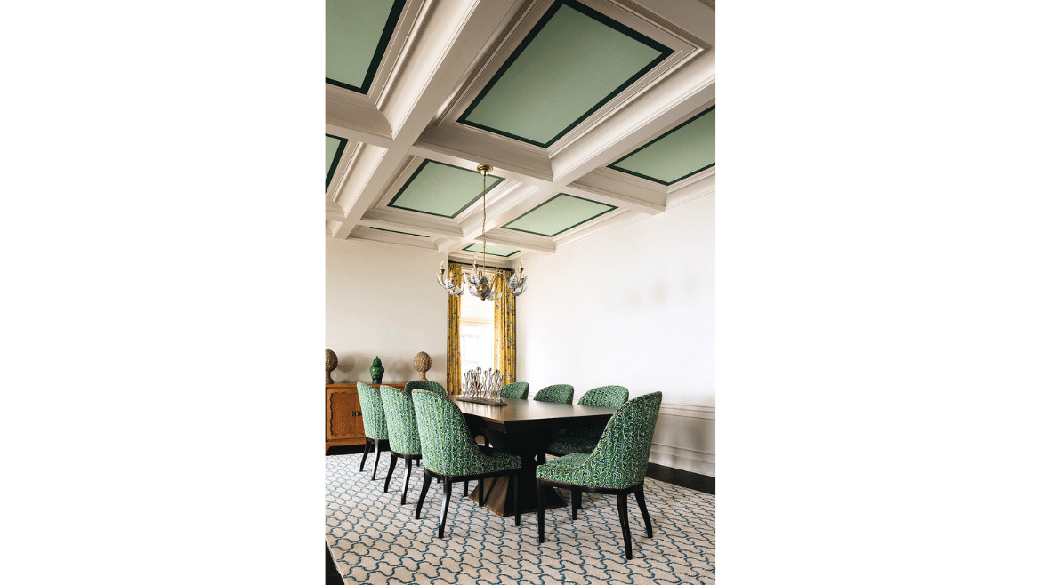
- Bright Coffered Ceiling – To modernize the living room’s blank plaster ceiling as well as brighten the space, the team added a coffered ceiling with vintage detailing, recessed lighting and a unexpected paint color.
- Top Tech – Technology that helps modernize the home include mirrored medicine cabinets that rise up, a toilet with an automatic seat and a TV that disappears behind cabinetry.
Adding More Connected Family Spaces
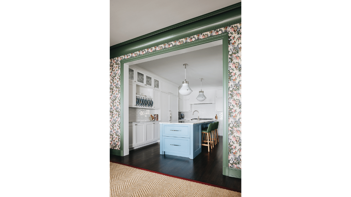
- Visual Connection – Part of the design intent was to create a much larger connection between the great room space and the family room space, versus a previously 6-foot wide opening with doors between the two. We made the opening as large as possible so that we could have that visual connection and all the light coming through from Lake Michigan. Panel molding that was deconstructed during the widening of the opening was recreated using the same geometry and trim, so it is indiscernible from the original woodwork.
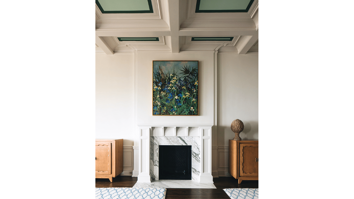
- Living and Dining Combo – What used to be an oversized living room is now a combination living and dining area with a brand new working fireplace and coffered ceiling detailing that brightens the space with bold color.
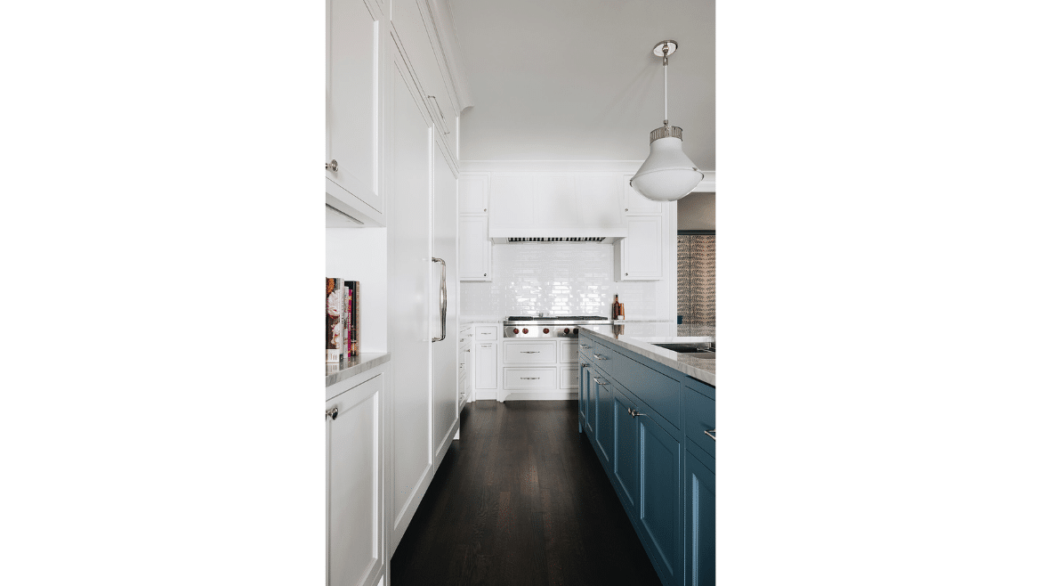
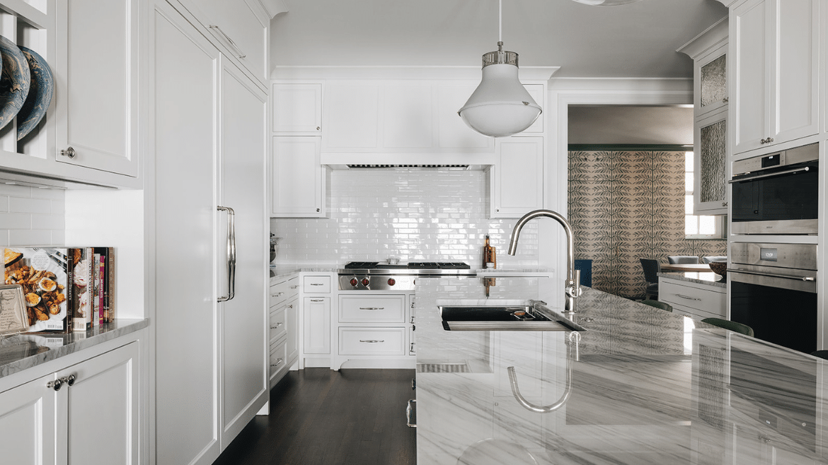
- Kitchen Move – One very exciting design challenge of this project was moving the entire kitchen from the back of the home, where it was overlooking a dark fire escape, to the front of the home, where there was never a kitchen before. This was an extreme challenge, requiring running all new plumbing and gas underneath the floor slab of a more than 100-year-old high-rise building.
Creating More Privacy
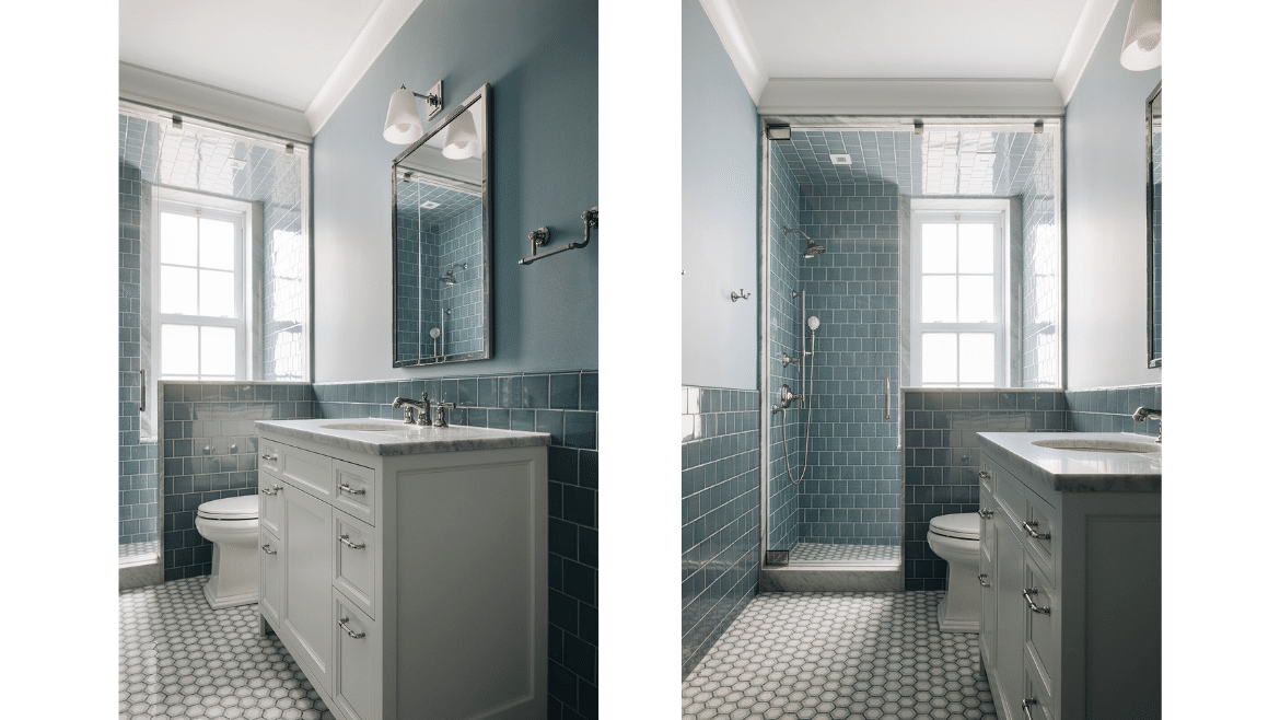
- New Powder Room – The old layout had no guest powder room. With some clever planning and some redesigning of spaces we were able to run new plumbing and add a hallway bathroom so guests don’t have to enter the family wing.
- Additional Bedrooms – The entire north side of the apartment was previously the maid’s wing, which was completely chopped up and dark. It now hosts four spacious bedrooms, each with its own bathroom.
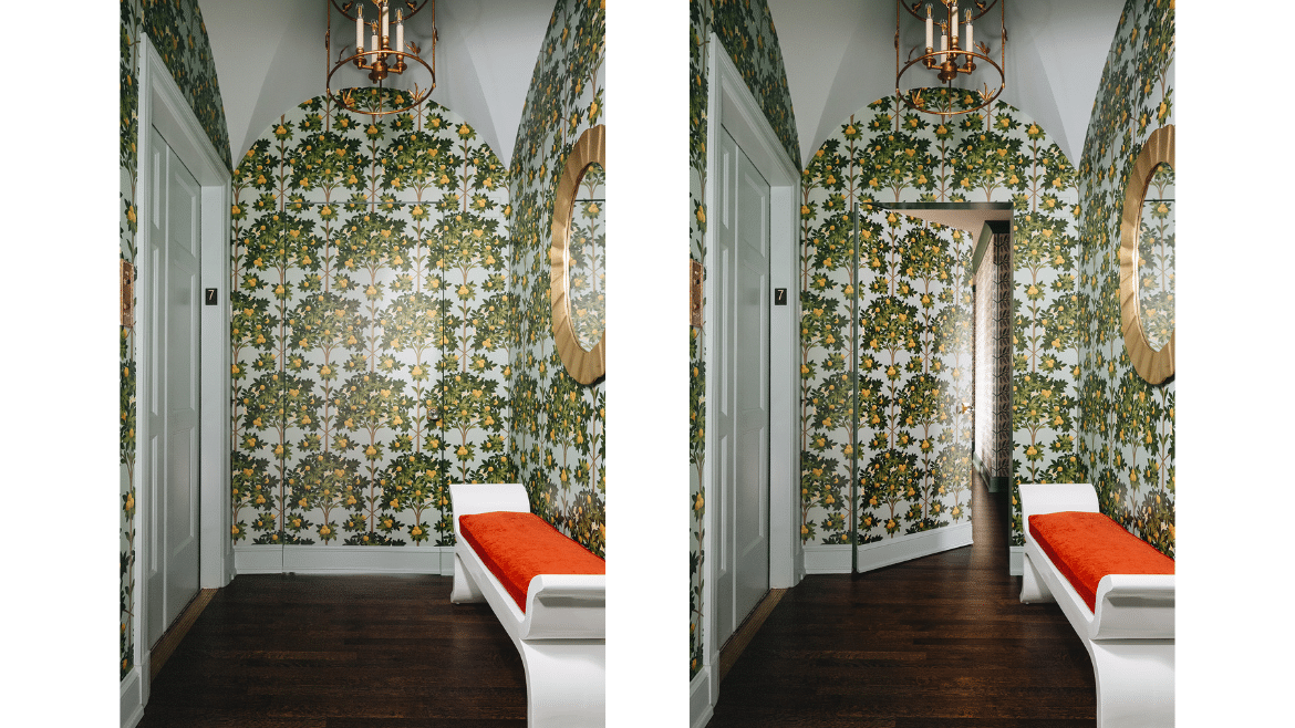
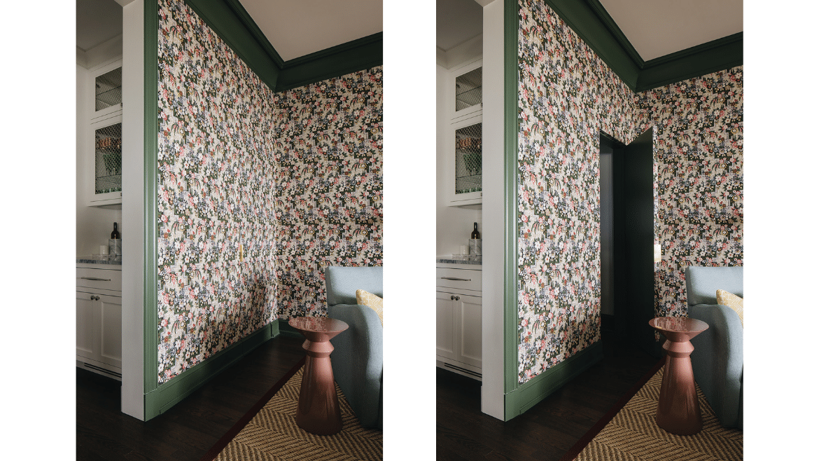
- Elevator Vestibule – The elevator in this particular building opens directly into each unit. Something that was very important to these homeowners was, in addition to having this formal vestibule, having a secondary “hidden” door opening that leads directly into the kitchen.
Managing Quirks of an Older Home During a Renovation
- Blended old/new hardwood floors – The hardwood floor is a combination of new floor, where there has been so much remodeling work that we could not keep the existing floor, and the beautiful original floor. It was all patched, matched and refinished to appear as if it were laid at the same time – not a hundred years apart!
- Custom fabricated cabinets – In a very old building – or any building for that matter – the ceiling and walls and floor are not necessarily level or uniform dimensions. To manage around, we had all of the cabinets custom fabricated for this space alone, to be sure they would fit.
- Space for modern home electronics – Older home walls aren’t usually designed to support conduit needed for modern-day electronics. We chose to furr out a family room wall to install a television junction box and also created a hidden storage closet that holds all of the family gadgetry without being seen.
- Tight workspace – The tight spaces and logistics of a high-rise required that all of the demolition be done by hand. Everything that came out of this house went down seven floors through an alley and out to a truck. While fabricating cabinets and cabinet side panels, we had to make sure that not only were they going to fit in the elevator, but they had to fit through the maze of the lower level that connects to the drop-off alley and the freight elevator.
- Coffered ceiling – We wanted to bring the scale of the living room down and also add some interest to a ceiling that’s otherwise 30 feet by 22 feet by adding beams and installing recessed lights. However, upon opening up the ceiling, we found concrete beams everywhere we wanted to have the lights. So, we worked with our extremely talented electrician to find a different type of recessed light that is shallower, about 2 inches deep, which look very similar to the other recessed lights in the house.
- Stone and wood fireplace – In place of what was an old stone fireplace with gilt overmantel and mirror we constructed a simple, classic wood mantel with a beautiful stone surround and were able to make it operational instead of just ornamental.
- Discovered window – There was a bathroom that had an air-conditioning condensing unit installed right over the bathtub, making it unusable. When we removed the air-conditioning unit, we actually found an old window opening. We were able to install a new window to make it bright and beautiful with cozy under tile floor heating and amazing cabinetry.
The wonderful shorthand occurring on a single design and build team that works consistently with the same subcontractors, as well as having everyone in place from day one, made it much easier for us to bring a monumental renovation to life in this co-op building. We were able to create and share required documentation, manage the board approvals process and provide quick responses – shaving months off of the construction time and speeding the family to a colorful and exciting move-in day.
Photography: Stoffer Photography Interiors
– – –
Save this to your Ideabook on Houzz
Houzz


